In 1939, audiences watching The Wizard of Oz witnessed a moment that had never happened before: a film that literally shifted from sepia to vivid, impossible color as a character opened a door. That transition wasn’t just a technical marvel—it was a narrative declaration. Dorothy stepped from a monochrome Kansas into a world where the yellow brick road glowed, the Wicked Witch’s skin was a sickly green, and ruby slippers seemed to pulse with light.
Technicolor’s three-strip process, perfected in 1932, didn’t just add color to movies. It gave filmmakers a new language—a way to paint emotions, signal shifts in reality, and create psychological depth. Before Technicolor, color was a gimmick, reserved for spectacle and fantasy. After it, color became a tool as expressive as dialogue or music. This is the story of how a beam-splitting prism and three reels of black-and-white film transformed the grammar of cinema.
The Mechanics of Magic: How Three-Strip Technicolor Worked
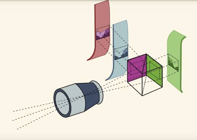
To understand why Technicolor looked so distinct, you have to understand its machinery. The three-strip camera didn’t record color onto a single piece of film. Instead, it used a prism inside the camera to split incoming light into three beams, each exposing a separate black-and-white negative—one filtered for red, one for green, one for blue. These three negatives were then combined through a dye-transfer process, where each strip’s image was printed onto a single piece of film using colored dyes.
This approach had two immediate consequences. First, it produced color that was extraordinarily saturated and stable. The dye-transfer prints from the 1930s and 1940s still look vibrant today, while many early Eastmancolor films have faded to pink. Second, it was wildly expensive and cumbersome. The cameras were heavy, the film stock was three times as much, and the lighting requirements were enormous—often three to four times more light than black-and-white. A Technicolor consultant, often Natalie Kalmus, was assigned to every production to ensure color was used “correctly,” a mandate that regularly put her in conflict with directors.
But these constraints were also a gift. The cost and complexity forced filmmakers to think about color from the very beginning of a project. They couldn’t just point a camera and hope for the best. Sets, costumes, makeup, and lighting were all designed with a specific palette in mind. This deliberate planning is why the best Technicolor films feel so cohesive—every frame is a carefully composed canvas.
The Storytelling Shift: From Sepia to Oz
Before Technicolor, filmmakers had a crude vocabulary for color. They used tinting—dipping film in dye—to signal night (blue) or fire (red), and toning to chemically color the silver in the image. But these were applied after the fact, not captured in-camera. Color wasn’t part of the story; it was a decorative afterthought.
Three-strip Technicolor changed that by making color an intrinsic part of the image. Directors like Victor Fleming recognized its narrative potential. In The Wizard of Oz, the sepia-toned Kansas sequences ground the story in a drab, monochrome reality. When Dorothy enters Munchkinland, the screen explodes into saturated hues—a visual metaphor for imagination and possibility. This wasn’t just pretty; it was structural. The transition from sepia to color became a storytelling device that told the audience, “You are now in a different world.”
Michael Powell and Emeric Pressburger took this even further in films like Black Narcissus (1947) and The Red Shoes (1948). In Black Narcissus, a group of nuns attempts to establish a convent in the Himalayas, and Powell used Technicolor’s richness to create a fever-dream atmosphere. The mountains are lush and threatening, the nuns’ habits are stark white against vivid landscapes, and the color itself seems to pulse with repressed desire. The film’s psychological tension is carried as much by hue as by dialogue.
Vincente Minnelli, a director with a background in musicals, treated color like a musical score. In An American in Paris (1951), he choreographed the ballet sequence with colors that shift with the mood—warm golds for romance, cool blues for loneliness. The color isn’t just decorative; it’s a narrative instrument, playing in harmony with the music and movement.
Douglas Sirk, working in the melodrama genre in the 1950s, used Technicolor’s saturation to subversive effect. All That Heaven Allows (1955) tells the story of a widow who falls in love with a younger gardener, and Sirk bathed the film in lurid reds and greens that feel almost too intense for the suburban setting. These colors signal the repressed desire and social hypocrisy simmering beneath the surface. The very excess of Technicolor becomes a critique of the conformity it depicts.
The Golden Age and the Fall: Why Technicolor Disappeared
Technicolor reached its peak during the studio system era, when big budgets and controlled production allowed for the process’s demands. Disney was an early adopter—Snow White and the Seven Dwarfs (1937) and Pinocchio (1940) are still considered benchmarks of animated color. Studios like MGM and Warner Bros. embraced it for their prestige productions, and by 1939, Gone with the Wind had cemented the process as a tool for epic storytelling.
But the very factors that made three-strip Technicolor so beautiful—its cost, its complexity, its need for consultants—also made it vulnerable. In 1950, Eastmancolor arrived. It was a single-strip process that could be shot on any standard camera and processed anywhere, with no specialist consultants required. The quality was good, though less saturated and less stable, but the convenience was overwhelming. By 1955, the three-strip era was over. Some films continued to be “printed in Technicolor” using the dye-transfer process from Eastmancolor negatives (including The Godfather Part II in 1974 and Apocalypse Now in 1979), but the unique look of three-strip color was gone.
The Legacy: Why We Still See in Technicolor
Technicolor’s influence didn’t end when the cameras were retired. Its aesthetic has become shorthand for a certain kind of filmmaking—heightened, dreamlike, emotionally charged. Directors like Wes Anderson, with his symmetrical compositions and deliberate palettes, and Guillermo del Toro, with his lush, saturated fantasy worlds, owe a debt to the Technicolor look. Even when they shoot digitally, they emulate its saturated colors and careful design.
Modern color grading tools allow filmmakers to approximate Technicolor’s tones, and restorations of classic films have brought the three-strip prints back to life. But the true legacy of Technicolor is not in the color itself—it’s in the lesson it taught: that color is not just a surface detail, but a fundamental part of how stories are told. The constraints of the process forced filmmakers to think about color as a narrative element, and that thinking has persisted long after the technology became obsolete.
Three-strip Technicolor lasted barely two decades, but it permanently altered the visual vocabulary of cinema. It turned color from a novelty into a language—a way to signal fantasy, express emotion, and critique society. The next time you watch a film that uses color to make you feel something, you’re seeing the ghost of Technicolor at work.
Summary
- Technicolor’s three-strip process used a prism to capture red, green, and blue separately, then combined them through dye-transfer, producing saturated, stable color.
- It was expensive and complex, requiring heavy cameras, three times the film stock, and 3-4 times more light, plus a Technicolor consultant on set.
- Directors like Victor Fleming, Michael Powell, Vincente Minnelli, and Douglas Sirk used color as a narrative tool—to signal fantasy, express psychology, and critique society.
- Eastmancolor’s single-strip convenience killed three-strip Technicolor by 1955, but its aesthetic lives on in modern filmmaking and digital color grading.
FAQ
Q: How did Technicolor differ from earlier color film processes?
A: Earlier processes like tinting and toning added color to film after shooting, using dyes or chemicals. Technicolor captured color in-camera using three separate black-and-white negatives, resulting in richer, more accurate, and stable color.
Q: Why was Technicolor so expensive?
A: The three-strip camera used three times as much film, required enormous lighting (3-4 times more than black-and-white), and needed a dedicated Technicolor consultant. The dye-transfer printing was also labor-intensive. These costs limited it to big-budget studio productions.
Q: What made the Technicolor look distinctive?
A: The dye-transfer process produced deep, saturated reds and blues, lush greens, warm skin tones, and a slightly heightened, dreamlike quality. It also had exceptional archival stability, so many films from the era survive in near-pristine condition.
Q: Why did Technicolor decline?
A: Eastmancolor, introduced in 1950, was a single-strip process that was cheaper, easier, and could be used with standard cameras. Studios abandoned three-strip Technicolor for convenience, even though the color quality was arguably less impressive.
Q: How did directors use color for storytelling?
A: Directors like Victor Fleming used color to contrast reality and fantasy (The Wizard of Oz), Michael Powell used it to convey psychological states (Black Narcissus), and Douglas Sirk used it to critique conformity (All That Heaven Allows). Color became a narrative device, not just a visual decoration.
Leave a Reply