Tag: cinematography

  • How Powell and Pressburger’s *The Red Shoes* Revolutionized Technicolor Filmmaking

    How Powell and Pressburger’s *The Red Shoes* Revolutionized Technicolor Filmmaking

    In 1948, a British film about a ballerina who dances herself to death was released to a lukewarm reception in its home country. Within a year, it had crossed the Atlantic and become a sensation, eventually earning two Academy Awards and redefining what color could do in cinema. The film was The Red Shoes, and its directors, Michael Powell and Emeric Pressburger, had just made a movie that would quietly upend every rule of Technicolor filmmaking.

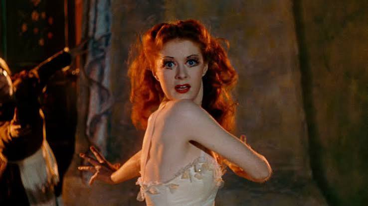
    Most color films of the era used the process to make musicals brighter or historical epics more lavish. Powell and Pressburger, working with cinematographer Jack Cardiff, treated color as a psychological tool—saturating reds to near-neon intensity, using lighting as a color source, and building a 15-minute ballet sequence that still leaves audiences wondering how it was done. This was not decoration. It was emotion, made visible.

    The Archers and Their Unlikely Hit

    Michael Powell and Emeric Pressburger formed a partnership in the early 1940s, calling themselves “The Archers” after their production company. They made a string of distinctive British films, from the supernatural A Matter of Life and Death to the wartime classic Black Narcissus. But The Red Shoes was their boldest swing yet—a backstage melodrama about a young ballerina, Victoria Page (Moira Shearer), who is torn between her love for a young composer and the ruthless impresario who demands total devotion to art.

    The film was a gamble. It starred a real ballet dancer, Moira Shearer, who was making her acting debut. Its plot was a meditation on artistic obsession. And it was shot in Technicolor, which at the time was still mostly reserved for musicals, fantasies, or historical epics. Psychological dramas were expected to be in black and white.

    In the UK, the film initially flopped. But in the United States, it found an audience through word of mouth, slowly building into one of the most profitable British films of its era. By the end of its run, it had won two Academy Awards (for Best Art Direction and Best Score) and been nominated for Best Picture, Best Director, and Best Story. More importantly, it had shown a generation of filmmakers what color could actually do.

    Technicolor Before The Red Shoes

    To understand the film’s impact, you have to understand what Technicolor was like in 1948. The three-strip process required a massive camera that exposed three separate black-and-white negatives simultaneously—each one filtered through a different primary color. It was expensive, complicated, and required enormous amounts of light.

    The result, when done well, was vivid and saturated. But it was also often used simply to make things look pretty. Films like Gone with the Wind or The Wizard of Oz used color for spectacle; the camera captured what was there, and the goal was to make it look as close to reality as possible—only more colorful.

    Jack Cardiff, the cinematographer for The Red Shoes, had different ideas. He saw color as a source of emotion, not just a filter. Instead of using white light and letting the colors of the set and costumes do the work, Cardiff used colored gels and filters to light the scenes themselves. He bounced colored light off surfaces, used smoke to diffuse it, and manipulated exposure to create painterly effects that went far beyond naturalistic reproduction.

    This was a radical departure. Cardiff was treating light itself as a color, not just the objects the light fell on. And Powell and Pressburger were thinking about color in equally expressive terms.

    Color as Psychology

    The most obvious example is the use of red. Throughout the film, red is not just a color—it is a symbol. It appears in the ballet slippers that Victoria puts on, in the curtain of the stage, in the blood that stains her feet as she dances herself to death. But Powell and Pressburger weren’t content with simple symbolism. They used saturation and contrast to make red feel almost violently alive.

    When Victoria is on stage, the reds are hyper-saturated, pushed to near-neon intensity. The rest of the film uses a more muted palette, with natural skin tones and subdued backgrounds. The effect is that red doesn’t just appear when something important happens—it seems to leak out of the screen, grabbing the viewer’s attention with a force that is almost uncomfortable.

    This was expressive color, not decorative color. It was color used to convey psychological states, to externalize the internal debate between love and art that is the film’s central theme. The red shoes are not just a prop; they are a manifestation of Victoria’s obsession, and the film’s use of color makes sure we feel that obsession in our gut.

    The Ballet Sequence: A Technical and Artistic Marvel

    At the center of the film is a 15–17 minute ballet sequence that has become legendary. It tells the story of a girl who puts on red shoes and cannot stop dancing, and it is framed as a performance by Victoria’s troupe. But as the sequence unfolds, it becomes something more than a stage show.

    The camera follows Victoria as she dances, and the world around her begins to change. A newspaper becomes a swirling sky. A room melts into a surreal dreamscape. The transitions are seamless, with live action, painted backdrops, and expressionistic set changes blending together so smoothly that it’s easy to believe the entire sequence was shot in a single continuous take.

    It wasn’t. The sequence was meticulously choreographed and edited over several weeks, using multiple setups, process shots, and trick photography. Cardiff and his team used rear projection, matte paintings, and forced perspective to create transitions that look impossible, even today.

    The ballet is not just a technical showpiece. It is a psychological projection of Victoria’s dilemma. The red shoes force the girl to dance to death, mirroring the choice Victoria faces in her own life—between the love of composer Julian Craster and the demands of impresario Boris Lermontov, who tells her that a dancer who relies on the doubtful comforts of human love will never be a great dancer. The ballet makes that conflict visible, using the stage as a mirror for the character’s inner turmoil.

    This was radical. Most films of the era treated “show within a show” sequences as simple spectacle—a chance to show off the studio’s production values. Powell and Pressburger used it to advance character and theme, making the ballet an essential part of the story rather than a break from it.

    Influence and Rediscovery

    The immediate influence of The Red Shoes can be seen in the work of directors who grew up watching it. Martin Scorsese has cited it as a major inspiration, and his use of saturated red in Raging Bull owes a clear debt to Powell and Pressburger’s color palette. Darren Aronofsky’s Black Swan (2010) is almost a direct homage, with its ballet setting and its descent into obsession.

    But the film’s influence goes beyond direct references. It helped convince a generation of filmmakers that color could be used for emotional and psychological ends, not just spectacle. It opened the door for the bold, expressive color palettes of the 1950s and 1960s, from Douglas Sirk’s melodramas to the saturated hues of early Technicolor epics.

    Why, then, are Powell and Pressburger often forgotten? The answer lies in the changing tastes of the 1960s. British cinema turned toward social realism, and Powell and Pressburger’s flamboyant, stylized approach fell out of fashion. Powell’s own career was effectively derailed by the critical revulsion to his 1960 film Peeping Tom, a psychological horror film that was savaged at the time and is now considered a classic. The pair’s work was rediscovered in the 1970s by American directors like Scorsese, Coppola, and De Palma, who championed them as masters.

    Despite this, they never achieved the same level of popular recognition as Hitchcock or Lean. The Red Shoes is now widely available and regularly screened at film festivals, but it remains a film that is more beloved by filmmakers and critics than by the general public. That is a shame, because it is not just a technical achievement—it is a deeply emotional film that uses every tool at its disposal to tell a story about the price of artistic passion.

    Why It Still Matters

    The technical achievements of The Red Shoes are remarkable, but they are not the reason the film endures. The reason is that Powell and Pressburger used those techniques to tell a universal story—about the choices we make between love and ambition, and about the sacrifices that art demands.

    The ballet sequence, with its impossible transitions and its saturated reds, is not just a display of visual virtuosity. It is an attempt to put the viewer inside Victoria’s mind, to make us feel the seductive pull of art even as it destroys her. That is something that no amount of technical skill can achieve on its own; it requires a director who understands that color, movement, and sound are not just tools for telling a story, but tools for creating emotion.

    Powell and Pressburger were such directors, and The Red Shoes remains their masterpiece—a film that changed how filmmakers thought about color, and that continues to inspire new generations of artists to push the boundaries of what cinema can do.

    The Red Shoes is a film that should not work. It is a ballet movie that is not really about ballet. It is a color film that uses color to depict psychological states. It is a melodrama with a dark, tragic ending. Yet it all comes together in a way that is both deeply emotional and visually breathtaking. Powell and Pressburger, with the help of Jack Cardiff, did not just make a great film—they expanded the language of cinema itself, showing that color could be used to express the interior life of a character, not just to decorate a scene. If you have not seen it, seek it out. And if you have, watch it again—you will notice something new every time.

    Summary

    • The Red Shoes (1948) is a British film by Michael Powell and Emeric Pressburger that used Technicolor expressively, not just decoratively.
    • Cinematographer Jack Cardiff used colored lighting and filters to create painterly, emotional effects, pushing reds to near-neon intensity.
    • The 15-minute ballet sequence blended live action, painted backdrops, and trick photography to depict a character’s psychological conflict, not just spectacle.
    • The film was a box office failure in the UK but became a hit in the US, winning two Academy Awards.
    • Powell and Pressburger were later rediscovered by directors like Martin Scorsese, and The Red Shoes influenced the color palettes of films like Raging Bull and Black Swan.

    FAQ

    Q: Was the ballet sequence in The Red Shoes shot in a single continuous take?
    A: No. It was meticulously choreographed and edited over several weeks using multiple setups, process shots, and trick photography, including rear projection, matte paintings, and forced perspective.

    Q: What was three-strip Technicolor?
    A: It was a color film process that used a special camera exposing three separate black-and-white negatives through red, green, and blue filters. The negatives were then combined to create a full-color image. It required huge amounts of light and was expensive and complex.

    Q: Why is the use of red in the film significant?
    A: Red is used as a psychological symbol for passion, obsession, and artistic sacrifice. It appears when Victoria’s inner life is at stake, and the saturation is heightened to create an emotional impact, making the color feel almost violent.

    Q: Who were Powell and Pressburger?
    A: Michael Powell and Emeric Pressburger were a British filmmaking duo known as “The Archers.” They made influential films in the 1940s and 1950s but fell out of fashion in the 1960s. They were rediscovered in the 1970s by directors like Martin Scorsese.

    Q: How did The Red Shoes influence later films?
    A: It inspired directors like Martin Scorsese (who restored the film in 2009) and Darren Aronofsky, whose Black Swan is a direct homage. Its use of saturated color and psychological ballet sequences shaped how color could be used expressively in cinema.

  • Painting with Light: How Three-Strip Technicolor Changed the Way Films Tell Stories

    Painting with Light: How Three-Strip Technicolor Changed the Way Films Tell Stories

    In 1939, audiences watching The Wizard of Oz witnessed a moment that had never happened before: a film that literally shifted from sepia to vivid, impossible color as a character opened a door. That transition wasn’t just a technical marvel—it was a narrative declaration. Dorothy stepped from a monochrome Kansas into a world where the yellow brick road glowed, the Wicked Witch’s skin was a sickly green, and ruby slippers seemed to pulse with light.

    Technicolor’s three-strip process, perfected in 1932, didn’t just add color to movies. It gave filmmakers a new language—a way to paint emotions, signal shifts in reality, and create psychological depth. Before Technicolor, color was a gimmick, reserved for spectacle and fantasy. After it, color became a tool as expressive as dialogue or music. This is the story of how a beam-splitting prism and three reels of black-and-white film transformed the grammar of cinema.

    The Mechanics of Magic: How Three-Strip Technicolor Worked

    To understand why Technicolor looked so distinct, you have to understand its machinery. The three-strip camera didn’t record color onto a single piece of film. Instead, it used a prism inside the camera to split incoming light into three beams, each exposing a separate black-and-white negative—one filtered for red, one for green, one for blue. These three negatives were then combined through a dye-transfer process, where each strip’s image was printed onto a single piece of film using colored dyes.

    This approach had two immediate consequences. First, it produced color that was extraordinarily saturated and stable. The dye-transfer prints from the 1930s and 1940s still look vibrant today, while many early Eastmancolor films have faded to pink. Second, it was wildly expensive and cumbersome. The cameras were heavy, the film stock was three times as much, and the lighting requirements were enormous—often three to four times more light than black-and-white. A Technicolor consultant, often Natalie Kalmus, was assigned to every production to ensure color was used “correctly,” a mandate that regularly put her in conflict with directors.

    But these constraints were also a gift. The cost and complexity forced filmmakers to think about color from the very beginning of a project. They couldn’t just point a camera and hope for the best. Sets, costumes, makeup, and lighting were all designed with a specific palette in mind. This deliberate planning is why the best Technicolor films feel so cohesive—every frame is a carefully composed canvas.

    The Storytelling Shift: From Sepia to Oz

    Before Technicolor, filmmakers had a crude vocabulary for color. They used tinting—dipping film in dye—to signal night (blue) or fire (red), and toning to chemically color the silver in the image. But these were applied after the fact, not captured in-camera. Color wasn’t part of the story; it was a decorative afterthought.

    Three-strip Technicolor changed that by making color an intrinsic part of the image. Directors like Victor Fleming recognized its narrative potential. In The Wizard of Oz, the sepia-toned Kansas sequences ground the story in a drab, monochrome reality. When Dorothy enters Munchkinland, the screen explodes into saturated hues—a visual metaphor for imagination and possibility. This wasn’t just pretty; it was structural. The transition from sepia to color became a storytelling device that told the audience, “You are now in a different world.”

    Michael Powell and Emeric Pressburger took this even further in films like Black Narcissus (1947) and The Red Shoes (1948). In Black Narcissus, a group of nuns attempts to establish a convent in the Himalayas, and Powell used Technicolor’s richness to create a fever-dream atmosphere. The mountains are lush and threatening, the nuns’ habits are stark white against vivid landscapes, and the color itself seems to pulse with repressed desire. The film’s psychological tension is carried as much by hue as by dialogue.

    Vincente Minnelli, a director with a background in musicals, treated color like a musical score. In An American in Paris (1951), he choreographed the ballet sequence with colors that shift with the mood—warm golds for romance, cool blues for loneliness. The color isn’t just decorative; it’s a narrative instrument, playing in harmony with the music and movement.

    Douglas Sirk, working in the melodrama genre in the 1950s, used Technicolor’s saturation to subversive effect. All That Heaven Allows (1955) tells the story of a widow who falls in love with a younger gardener, and Sirk bathed the film in lurid reds and greens that feel almost too intense for the suburban setting. These colors signal the repressed desire and social hypocrisy simmering beneath the surface. The very excess of Technicolor becomes a critique of the conformity it depicts.

    The Golden Age and the Fall: Why Technicolor Disappeared

    Technicolor reached its peak during the studio system era, when big budgets and controlled production allowed for the process’s demands. Disney was an early adopter—Snow White and the Seven Dwarfs (1937) and Pinocchio (1940) are still considered benchmarks of animated color. Studios like MGM and Warner Bros. embraced it for their prestige productions, and by 1939, Gone with the Wind had cemented the process as a tool for epic storytelling.

    But the very factors that made three-strip Technicolor so beautiful—its cost, its complexity, its need for consultants—also made it vulnerable. In 1950, Eastmancolor arrived. It was a single-strip process that could be shot on any standard camera and processed anywhere, with no specialist consultants required. The quality was good, though less saturated and less stable, but the convenience was overwhelming. By 1955, the three-strip era was over. Some films continued to be “printed in Technicolor” using the dye-transfer process from Eastmancolor negatives (including The Godfather Part II in 1974 and Apocalypse Now in 1979), but the unique look of three-strip color was gone.

    The Legacy: Why We Still See in Technicolor

    Technicolor’s influence didn’t end when the cameras were retired. Its aesthetic has become shorthand for a certain kind of filmmaking—heightened, dreamlike, emotionally charged. Directors like Wes Anderson, with his symmetrical compositions and deliberate palettes, and Guillermo del Toro, with his lush, saturated fantasy worlds, owe a debt to the Technicolor look. Even when they shoot digitally, they emulate its saturated colors and careful design.

    Modern color grading tools allow filmmakers to approximate Technicolor’s tones, and restorations of classic films have brought the three-strip prints back to life. But the true legacy of Technicolor is not in the color itself—it’s in the lesson it taught: that color is not just a surface detail, but a fundamental part of how stories are told. The constraints of the process forced filmmakers to think about color as a narrative element, and that thinking has persisted long after the technology became obsolete.

    Three-strip Technicolor lasted barely two decades, but it permanently altered the visual vocabulary of cinema. It turned color from a novelty into a language—a way to signal fantasy, express emotion, and critique society. The next time you watch a film that uses color to make you feel something, you’re seeing the ghost of Technicolor at work.

    Summary

    • Technicolor’s three-strip process used a prism to capture red, green, and blue separately, then combined them through dye-transfer, producing saturated, stable color.
    • It was expensive and complex, requiring heavy cameras, three times the film stock, and 3-4 times more light, plus a Technicolor consultant on set.
    • Directors like Victor Fleming, Michael Powell, Vincente Minnelli, and Douglas Sirk used color as a narrative tool—to signal fantasy, express psychology, and critique society.
    • Eastmancolor’s single-strip convenience killed three-strip Technicolor by 1955, but its aesthetic lives on in modern filmmaking and digital color grading.

    FAQ

    Q: How did Technicolor differ from earlier color film processes?
    A: Earlier processes like tinting and toning added color to film after shooting, using dyes or chemicals. Technicolor captured color in-camera using three separate black-and-white negatives, resulting in richer, more accurate, and stable color.

    Q: Why was Technicolor so expensive?
    A: The three-strip camera used three times as much film, required enormous lighting (3-4 times more than black-and-white), and needed a dedicated Technicolor consultant. The dye-transfer printing was also labor-intensive. These costs limited it to big-budget studio productions.

    Q: What made the Technicolor look distinctive?
    A: The dye-transfer process produced deep, saturated reds and blues, lush greens, warm skin tones, and a slightly heightened, dreamlike quality. It also had exceptional archival stability, so many films from the era survive in near-pristine condition.

    Q: Why did Technicolor decline?
    A: Eastmancolor, introduced in 1950, was a single-strip process that was cheaper, easier, and could be used with standard cameras. Studios abandoned three-strip Technicolor for convenience, even though the color quality was arguably less impressive.

    Q: How did directors use color for storytelling?
    A: Directors like Victor Fleming used color to contrast reality and fantasy (The Wizard of Oz), Michael Powell used it to convey psychological states (Black Narcissus), and Douglas Sirk used it to critique conformity (All That Heaven Allows). Color became a narrative device, not just a visual decoration.

  • The Cinematic Language of Color: How Directors Use Palettes to Tell Stories

    The Cinematic Language of Color: How Directors Use Palettes to Tell Stories

    When you watch a film, color is more than just decoration—it’s a deliberate, pre-planned language that speaks directly to your emotions. From the sickly green of the Matrix to the warm amber of the Godfather’s corridors, directors and cinematographers use hue, saturation, and brightness to signal mood, define character, and even hide subtext in plain sight.

    But how does this visual grammar actually work? And why do certain palettes—like the ubiquitous teal and orange—dominate modern blockbusters? In this explainer, we’ll break down the science and art of cinematic color, exploring how filmmakers turn a spectrum into a story.

    The Three Axes of Cinematic Color

    Color in film operates on three primary axes: hue (the color itself), saturation (intensity vs. gray), and brightness (lightness to darkness). Directors manipulate these to create meaning. A desaturated, dark frame might signal despair, while a bright, saturated one suggests energy or artificiality. The key is that every choice is intentional—nothing is left to chance.

    From Technicolor to Digital Grading

    Color has been a storytelling tool since the 1930s, when Technicolor’s three-strip process produced hyper-saturated, painterly images in films like The Wizard of Oz. The shift from sepia Kansas to vibrant Oz is a classic example of color marking a transition between worlds. In the 1960s and 70s, New Hollywood favored desaturation and naturalism, as seen in gritty films like The French Connection. Then came the digital intermediate (DI) era in the 1990s, which allowed precise per-scene grading—and gave rise to the infamous teal and orange look.

    The Psychology of Hues

    Why does red feel urgent? Biologically, humans associate red with blood and danger, which can raise heart rate. Blue, on the other hand, evokes night and calm, lowering arousal. Green suggests nature or envy, depending on context. But cultural conditioning also plays a role: white is purity in the West but mourning in parts of East Asia. Directors exploit these associations to create instant emotional responses without a single line of dialogue.

    Case Study: The Matrix and the Green Tint

    In The Matrix (1999), the simulated world is bathed in a sickly green tint, while the real world is cold blue and steel. This color coding instantly tells the audience which reality they’re in, and the green’s unnatural quality subtly signals that something is off. It’s a perfect example of diegetic vs. non-diegetic color: the green is imposed by the grade, not by the world itself.

    Character Arcs Through Color

    Color can also track a character’s transformation. In Breaking Bad, Walter White’s clothing darkens from beige to black as he descends into criminality. In The Wizard of Oz, Dorothy’s journey from sepia Kansas to Technicolor Oz mirrors her awakening. Even in Moonlight (2016), blue appears both as danger and tenderness, reflecting the protagonist’s conflicted identity.

    The Teal and Orange Phenomenon

    Since the early 2000s, Hollywood has leaned heavily on teal and orange grading: skin tones are pushed orange, while shadows and backgrounds lean teal. This creates pleasing contrast but has been criticized as formulaic. Directors like Denis Villeneuve and cinematographer Roger Deakins have pushed back, favoring more naturalistic palettes in films like Dune and Blade Runner 2049. The trend shows how color trends can become clichés, prompting innovation.

    Color Scripts and Collaboration

    Creating a film’s palette is a collaborative effort. The production designer sets the look of sets and costumes, the cinematographer shapes light and lenses, and the colorist refines everything in post. Many directors, especially at Pixar, use “color scripts”—scene-by-scene color maps—to plan the emotional journey before shooting. This ensures that color serves the story at every turn.

    Subtext Without Words

    Sometimes color carries the entire subtext. In The Handmaid’s Tale, the red cloaks signify both fertility and oppression. In Parasite, the warm basement contrasts with the cold upper house, encoding class divisions. In Schindler’s List, the single red coat in a monochrome world becomes a moral beacon, drawing the eye and the conscience. These choices show that color can say what characters cannot.

    Cinematic color is a powerful, often invisible storyteller. By understanding how hue, saturation, and brightness work together, you can start to see the layers of meaning in every frame. Next time you watch a film, pay attention to the palette—it’s not just pretty, it’s purposeful.

    Summary

    • Color in film is a deliberate language using hue, saturation, and brightness to convey emotion, character, and subtext.
    • Historical shifts from Technicolor to digital grading have expanded the palette, but also led to trends like teal and orange.
    • Psychological and cultural associations make colors like red and blue powerful tools for instant emotional response.
    • Directors use color to track character arcs, signal transitions, and encode social commentary without dialogue.
    • Collaboration between production design, cinematography, and color grading ensures every hue serves the story.

    FAQ

    Q: What is the difference between color grading and production design?
    A: Color grading happens in post-production, where the entire frame’s colors are adjusted digitally. Production design involves physical elements on set—sets, costumes, props—that establish the palette before filming.

    Q: Why do so many movies use teal and orange?
    A: Teal and orange create strong contrast, especially with skin tones, making images pop. It became popular in the 2000s due to digital grading, but some directors now avoid it for more natural looks.

    Q: Can color meanings vary across cultures?
    A: Yes. For example, white is associated with purity in Western cultures but with mourning in some East Asian cultures. Directors must consider their audience’s cultural context.

    Q: How does color affect the audience psychologically?
    A: Colors can trigger physiological responses—red may raise heart rate, blue may lower it—and evoke emotional associations based on biology and culture.

    Q: What is a color script?
    A: A color script is a scene-by-scene map of the color palette, often used in animation, to plan the emotional arc of a film before production begins.