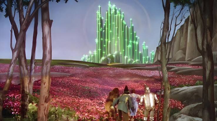
In 1939, audiences watched Dorothy step from a sepia Kansas into a Technicolor Oz, and cinema never looked the same. That shift wasn’t just a splash of paint—it was the result of a 400-pound camera, a beam-splitting prism, and a process that controlled every frame of color from lens to screen. Technicolor’s three-strip process didn’t merely add color; it created a new visual language that shaped how stories were told, how stars were styled, and how movies made money.
Before Technicolor, color on screen was a trick: hand-painted frames, single-color tints, or two-color processes that missed true blues and greens. Three-strip Technicolor, perfected in 1932, captured the full spectrum with a precision that made every hue pop. It was a technical marvel, an industrial monopoly, and an artistic tool—all rolled into one. This is the story of how a complex, expensive process became the signature look of Hollywood’s Golden Age and why its influence still colors our screens today.
The Problem with Early Color
Early filmmakers desperately wanted color, but the options were crude. Some films were hand-painted frame by frame—a laborious process that made The Birth of a Nation (1915) a marathon of manual work. Others used tinting, bathing entire scenes in a single color wash, or toning, which colored the dark areas only. Then came two-color processes like Kinemacolor and early Technicolor, which split the spectrum into just two strips—usually red and green. The result was a limited palette: skin tones looked waxy, and true blue and green were virtually impossible. It was color, but not as the eye sees it.
The Birth of Three-Strip Technicolor
Herbert Kalmus, Daniel Frost Comstock, and W. Burton Wescott founded Technicolor in Boston in 1916, but it took over a decade to crack the code. The breakthrough was a beam-splitting prism inside a specially modified camera. Light entered the lens and was split by the prism into three paths, each exposing a separate black-and-white film strip: one sensitive to red, one to green, and one to blue. The camera weighed over 400 pounds and required three times the lighting of black-and-white film—early sets were sweltering furnaces under the hot lights.
The three strips were then processed and combined using a dye-transfer (imbibition) process, where each strip’s image was dyed and transferred onto a single print. This was like printing money—each color was laid down in sequence, creating a saturated, vibrant image that was remarkably stable. Unlike later chemical processes that faded to pink, many Technicolor prints from the 1930s and 1940s still look vivid today.
The First Features in Living Color
The three-strip process debuted in a 1934 short, La Cucaracha, and the first full-length feature followed a year later: Becky Sharp (1935). But Technicolor was not an overnight sensation. It was expensive and required studios to sign exclusive contracts, using Technicolor cameras and labs. This vertical monopoly meant color films were rare and prestigious—event cinema that drew crowds simply because they were in color.
By 1939, Technicolor hit its stride with two landmarks: The Wizard of Oz and Gone with the Wind. These films didn’t just use color; they weaponized it. In Oz, the sepia-toned Kansas sequences made the saturated Technicolor of Munchkinland and the Emerald City feel like a different universe. In Gone with the Wind, the costumes and sets were pushed to operatic extremes, with Scarlett’s green curtain dress becoming an icon of cinematic excess.
The Technicolor Look: Not Real, but True
Technicolor was never about realism. It was a deliberately heightened aesthetic, where colors were chosen for emotional and symbolic impact. The legendary color consultant Natalie Kalmus—Herbert’s ex-wife—supervised color design on hundreds of films, wielding final say over costumes, sets, and lighting to ensure colors didn’t clash or “bleed.” Some directors resented her authority, but others embraced it. Vincente Minnelli, who directed An American in Paris (1951), saw Kalmus as a collaborator who helped him craft a painterly vision.
Other directors used Technicolor to subvert expectations. In Black Narcissus (1947), Powell and Pressburger created a hallucinatory atmosphere in a Himalayan convent, using saturated reds and blues to suggest repressed desire and madness. In Leave Her to Heaven (1945), Gene Tierney’s red hair and the teal water of a lake become visual motifs that amplify her character’s psychological menace. Even in a frothy musical like Singin’ in the Rain (1952), Technicolor injected a sense of pure joy and spectacle that black-and-white could never match.
The Business of Color
Technicolor’s business model was as brilliant as its engineering. By controlling the entire pipeline—cameras, film, processing, and even the color consultants—the company created a scarcity that made color films a premium product. Studios paid a premium to use Technicolor, and in return, they got a look that audiences couldn’t see anywhere else. This exclusivity lasted until the late 1940s, when antitrust actions and the rise of cheaper single-strip processes like Eastmancolor broke Technicolor’s stranglehold.
Eastmancolor, introduced in the 1950s, was simpler and cheaper—it could be used in any camera and processed by any lab. Within a decade, most Hollywood productions had abandoned three-strip Technicolor. Eastmancolor had its own problems, though: many early prints faded to a pinkish magenta, a chemical instability that Technicolor’s dye-transfer process had avoided.
The Legacy: Why Technicolor Still Matters
The last American three-strip Technicolor feature was The Godfather Part II (1974), which used the process for select prints. The original dye-transfer process was retired in the late 1970s, though it was resurrected briefly for a 2002 re-release of Apocalypse Now Redux. Today, the Technicolor brand survives as a post-production and visual effects company, but the original process is a relic of a bygone era.
Yet Technicolor’s influence endures. The “Technicolor look”—vibrant, saturated, larger than life—has become shorthand for a certain kind of cinematic magic. Modern filmmakers still evoke it, whether through digital color grading that mimics the dye-transfer palette or through homages like The Umbrellas of Cherbourg (1964) and Chungking Express (1994). When we see a film that makes colors pop with an uncanny intensity, we’re seeing the ghost of three-strip Technicolor, a process that didn’t just record reality but reimagined it.
Technicolor’s three-strip process was more than a technical achievement; it was a cultural force that defined the look of Hollywood’s Golden Age. By capturing the full spectrum with unprecedented vibrancy, it gave filmmakers a new canvas and gave audiences a new kind of spectacle. Though the cameras and labs are gone, the language of color they created still speaks to us every time we watch a film that dares to be more colorful than life itself.
Summary
- Three-strip Technicolor (1932–1955) captured color using three black-and-white film strips, each sensitive to red, green, or blue, combined via dye-transfer.
- The process required a 400-pound camera and three times the lighting of black-and-white film, making early Technicolor sets extremely hot.
- Technicolor’s vertical monopoly controlled cameras, film, labs, and even color consultants, making color films rare and prestigious until the late 1940s.
- The “Technicolor look” was deliberately heightened and symbolic, not naturalistic, with consultants like Natalie Kalmus shaping the aesthetic.
- The process declined in the 1950s with cheaper Eastmancolor, but its dye-transfer prints were more color-stable; many still look vivid today.
FAQ
Q: What made three-strip Technicolor different from earlier color processes?
A: Earlier processes were limited—hand-painting, tinting, or two-color systems that missed true blue and green. Three-strip Technicolor used a beam-splitting prism to expose three black-and-white strips simultaneously, capturing the full visible spectrum with accuracy and reproducibility.
Q: Why did Technicolor look so saturated and vibrant?
A: The dye-transfer (imbibition) process laid down each color separately, creating a rich, saturated image. Also, Technicolor’s color consultants deliberately chose colors for emotional impact, not realism, resulting in a heightened, almost hyper-real palette.
Q: Why did Technicolor decline in the 1950s?
A: The rise of cheaper single-strip processes like Eastmancolor, which could be used in any camera and processed by any lab, broke Technicolor’s monopoly. Studios switched to save money and gain flexibility.
Q: Is Technicolor still used today?
A: The original three-strip and dye-transfer processes are retired; the last feature to use three-strip was The Godfather Part II (1974) for select prints, and the last dye-transfer prints were made in 2002 for Apocalypse Now Redux. The Technicolor brand now operates in post-production and visual effects.
Q: What is the “Technicolor look” and why does it matter?
A: It’s a deliberately heightened, saturated color aesthetic that became iconic in Hollywood’s Golden Age. It influenced how filmmakers used color symbolically, and it still inspires modern filmmakers and colorists seeking that vibrant, larger-than-life quality.
Leave a Reply