In 1958, mathematician Roger Penrose and his father Lionel published a paper describing an impossible triangle a shape that looks like a solid 3D object but cannot actually exist. When M.C. Escher saw it, he was electrified. Within a few years, he used it to create Waterfall (1961) and Ascending and Descending (1960), two of his most famous works, where water flows uphill and monks climb stairs that loop forever.
Escher, a Dutch graphic artist with no formal mathematical training, had been exploring impossible geometries and interlocking patterns for decades. His work from tessellating lizards to the infinite Circle Limit prints turned abstract mathematical concepts into tangible, mind-bending images. What started as an artistic curiosity became a two-way street of inspiration: mathematicians saw their ideas visualized, and Escher found new creative fuel from their theories.
This article explores how Escher’s art did more than just look cool — it became a reference point for mathematicians, physicists, and cognitive scientists. His work helped make complex geometry accessible, influenced the study of quasicrystals, and continues to appear in scientific publications and classrooms today.
A Self-Taught Geometer
Maurits Cornelis Escher was born in 1898 in the Netherlands. He was a poor student, except in drawing, and initially pursued architecture before switching to graphic arts. He traveled extensively, and a visit to the Alhambra in Spain in 1922 and again in 1936 changed his artistic direction. The Moorish tile patterns — intricate, repeating, interlocking — fascinated him. He began to experiment with tessellations, the regular division of a plane with shapes that fit together without gaps or overlaps.
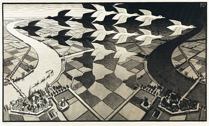
What set Escher apart was his transformation of abstract tiles into recognizable forms: birds, fish, reptiles, and even human figures. In prints like Day and Night (1938), white birds fly one way and black birds the other, interlocking to fill the sky. His work captured the eye because it combined mathematical precision with artistic whimsy.
Escher wasn’t trained in geometry beyond basic school math. He reportedly said that mathematicians “opened the door” for him, but he often struggled with formal theory. Instead, he worked intuitively, sketching endlessly until a pattern clicked. His tessellations, it turns out, correspond perfectly to the 17 wallpaper groups — the different ways to repeat a pattern in a plane using translations, rotations, reflections, and glide reflections. Escher discovered these groups on his own, long before he learned about the formal classification.
The Penrose Connection
In the late 1950s, Roger Penrose, then a young mathematician (and later a Nobel laureate in physics), and his father Lionel published their work on impossible objects. The Penrose triangle and Penrose stairs — structures that look plausible in a drawing but violate the laws of Euclidean geometry — captured Escher’s imagination. He had already played with impossible perspectives in works like Belvedere (1958), but the Penrose diagrams gave him a new toolkit.
Escher incorporated the Penrose triangle into Waterfall, where a stream appears to flow downhill, over a waterfall, and then somehow back to the top, forming an endless loop. The Penrose stairs appear in Ascending and Descending, where hooded monks march eternally up a staircase that returns them to the same level. These works became iconic examples of impossible constructions, delighting and puzzling viewers for decades.
For mathematicians, Escher’s use of these objects was more than a clever trick. The impossible triangle illustrates the difference between local and global consistency: each corner looks fine on its own, but the whole figure cannot exist in 3D. This theme resonates in physics, where locally plausible events can lead to globally impossible situations, and in cognitive science, where the brain tries to construct a coherent 3D interpretation from 2D images.
Hyperbolic Inspiration
Perhaps Escher’s most profound scientific connection was with H.S.M. Coxeter, a Canadian geometer who specialized in non-Euclidean geometry. In the late 1950s, Coxeter sent Escher a diagram of a hyperbolic tessellation — a pattern that fills a disk with infinitely shrinking shapes, illustrating the Poincaré disk model of hyperbolic space. In hyperbolic geometry, there are infinitely many lines through a point parallel to a given line, and the angles and lengths behave differently from Euclidean space.
Escher was captivated. He wrote to Coxeter, “I am trying to learn something from your figure.” The result was the Circle Limit series (1958–1960), four woodcuts that depict a finite disk filled with fish, angels, or devils that get smaller and smaller as they approach the edge. The figures are arranged in a way that mimics the hyperbolic plane, where distances increase exponentially as you move outward.
Coxeter later verified that Escher’s Circle Limit III was mathematically accurate to within a tiny margin of error — an extraordinary feat for an artist working without formal training. Escher had essentially visualized a concept that many people find counterintuitive, even after years of study. His prints made hyperbolic space tangible, and they remain among the best visualizations of the concept ever created by hand.
From Art to Science
Escher’s influence extended beyond mathematics into physics and crystallography. In 1982, scientist Dan Shechtman discovered quasicrystals — materials with ordered but non-repeating atomic patterns, which seemed to violate the established rules of crystallography. His discovery, which earned him the 2011 Nobel Prize in Chemistry, was initially met with skepticism because the patterns did not fit the periodic repetition seen in ordinary crystals.
Researchers quickly noticed a conceptual parallel between quasicrystals and Escher’s tessellations. Escher had created patterns that fill the plane without ever repeating exactly, using clever manipulations of symmetry. His works, like the tessellating horsemen in Metamorphosis II, demonstrate that non-repeating patterns can be orderly and aesthetically pleasing. For crystallographers, Escher’s art provided a visual analogy for the strange world of quasicrystals, where order exists without periodicity.
Escher’s prints also became a staple in cognitive psychology. His impossible objects and ambiguous figures are used to study how the brain processes visual information. For example, Relativity (1953) shows multiple staircases and platforms that connect in impossible ways, challenging the viewer’s assumptions about gravity and space. Researchers use such images to probe how the brain constructs a coherent picture from incomplete or contradictory visual cues.
A Cultural and Educational Icon
During his lifetime, Escher was not considered a “serious” artist by the fine-art establishment. He was viewed as a craftsman, and his works were often dismissed as mere optical illusions. But in the 1960s, his popularity soared among a counterculture fascinated with altered perception and psychedelic visuals. His prints became posters in dorm rooms and album covers, and new generations discovered the mind-bending possibilities of geometry.
Posthumously, Escher’s reputation has grown. The Escher Museum in The Hague, which opened in 2002, houses a vast collection of his work. His images appear in textbooks, on journal covers, and in conference materials across mathematics, physics, computer science, and psychology. Douglas Hofstadter’s 1979 book Gödel, Escher, Bach used Escher’s art as a central metaphor, linking his paradoxes to Gödel’s incompleteness theorems and Bach’s musical fugues. The book, which won the Pulitzer Prize, introduced Escher to countless scientists and thinkers.
A Dialogue of Discovery
Escher’s collaboration with scientists was a true two-way exchange. He drew inspiration from mathematical concepts, and scientists found in his art a way to visualize abstract ideas. His tessellations demonstrate symmetry groups that mathematicians had catalogued but rarely illustrated so beautifully. His Circle Limit prints brought hyperbolic geometry to life in a way that no diagram had before.
His work also shows that visual intuition can sometimes outpace formal description. Escher created patterns that scientists later categorized and explained, proving that art can be a form of exploration. As Roger Penrose noted, “Escher managed to depict concepts that many people, including mathematicians, find difficult to grasp.” His art continues to bridge the gap between the scientific and the artistic, inviting us to see the impossible as a gateway to deeper understanding.
M.C. Escher was not a mathematician, but his work has become inseparable from scientific discovery. His impossible geometries, hyperbolic visions, and non-repeating tessellations continue to inspire researchers, educators, and students. By making abstract concepts visible, Escher showed that creativity and logic are not opposites — they are partners in understanding the universe. His legacy is a testament to the power of visual thinking, and his images remain as fresh and challenging today as they were decades ago.
Summary
- Escher’s tessellations correspond to the 17 wallpaper groups, though he discovered them intuitively.
- His Circle Limit prints accurately visualize hyperbolic space, verified by mathematician H.S.M. Coxeter.
- Escher used the Penrose triangle and stairs in his works, illustrating impossible objects that challenge perception.
- His non-repeating patterns provide a visual analogy for quasicrystals, discovered decades later.
- Escher’s art is widely used in cognitive science, textbooks, and as a bridge between art and mathematics.
FAQ
Q: Did M.C. Escher have formal mathematical training?
A: No, Escher was largely self-taught. He had basic schooling in math but no advanced training. He worked intuitively and often said that mathematicians ‘opened the door’ for him, but he discovered many geometric patterns on his own.
Q: What is the ‘Circle Limit’ series?
A: It is a series of four woodcuts (1958–1960) that depict hyperbolic geometry using the Poincaré disk model. The prints show figures shrinking as they approach the edge of a circle, illustrating the infinite and non-Euclidean nature of hyperbolic space.
Q: How did Escher’s work influence scientists?
A: Escher’s art helped scientists visualize abstract concepts like group theory, hyperbolic geometry, and non-repeating patterns. His work has been used in crystallography to explain quasicrystals and in cognitive science to study visual perception.
Q: What are the Penrose stairs?
A: The Penrose stairs are an impossible object where a staircase loops back to its starting point while continuously going upward. They were published by Lionel and Roger Penrose in 1958 and later used by Escher in his print Ascending and Descending.
Q: Why is Escher’s art popular in science education?
A: Because his prints make complex mathematical concepts tangible and engaging. They are used in textbooks and lectures to illustrate symmetry, infinity, and optical illusions, helping students grasp ideas that are otherwise highly abstract.